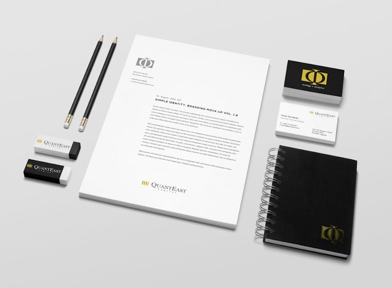
QuantEast Advisory
- QuantEast Advisory
- Logo design, Brand identity design
- 2015
Approach
QuantEast is an independent investment and asset management advisory firm that needed a logo and website to identify with. The logotype plays off the mathematical Golden Ratio to depict the firm as a financial institution and the word mark is a composition of big and neat fonts to emphasise class, professionalism and prominence of the firm. The firm upholds minimalism and therefore stressed that the concept be reflected in designing the website. Thus, the website is built with subtle and simple designs. It is user friendly, clean with easy to navigate tabs that allow users to quickly find what they are looking for.